Portfolio Dev Log
July 22, 2025
Documenting the thought process and learnings behind creating my current portfolio website, aka what you're looking at right now
Unrevised dev log can be found here
WORK IN PROGRESS
goals
I made my first portfolio website over winter break of freshman year (undergrad) to buff up my barren resume for an application to a robotics club.
I mocked it up in Figma, watched 3-4 Youtube tutorials on making a portfolio with just html/css, did some hacky CSS styling, and very minimal javascript.
I still like certain visual elements, but it’s a little plain, and not as responsive as it could be.
- I wanted to make a new portfolio website that better showcases my experience, taste, and personality.
- As someone who grew up on the internet and has at least ten different social media accounts across multiple platforms for a variety of purposes, I've flip flopped between strongly caring about the presentation of myself online, and not caring at all / wanting to minimize the information I put out.
- Recently, the pendulum has swung strongly - I currently see the value of visibility and proof by demonstration; the philosophy behind digital gardens; learning in public, working "with the door open"
- I've been interested in fun digital expriences lately (see websites I like) and I figured redoing my portfolio would be a casual but interesting way to learn how to implement fun visuals and interactions
- I also really wanted to add a blog section because I love documenting thought processes behind projects, and this would be the ideal location
I got the most frontend experience from working on a recent project, Jam Journal, using Next.js and Tailwind for the first time. Before this, I had some React and HTML/CSS experience but not enough to comfortably describe my skill level as intermediate. That project was a bit rushed because I was working on it in a 6 week build space - I wanted to use this portfolio revamp, something with no real deadline, as a chance to go slowly, code cleanly, and really strengthen my foundational knowledge.
I'm writing this to document thought processes and challenges. Also, learning happens best through teaching and explaining.
high-level process
Exploring what really feels like me, my identity, and how I want to present myself in the form of a website.
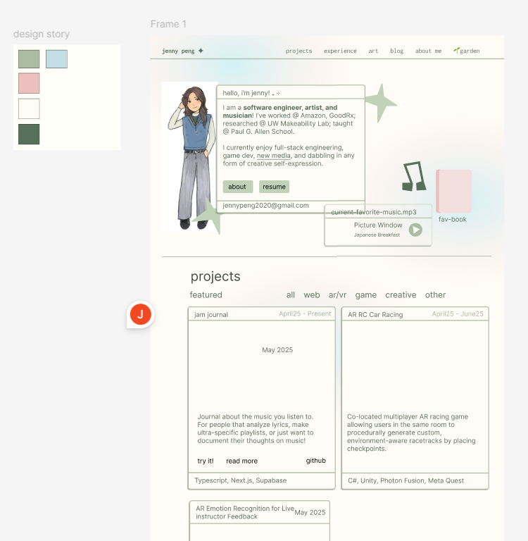
- I made a Figma mockup as a rough sketch of what I wanted. This wasn't the most high fidelity, but it had the color palette, general layout, and planned content defined
- I started coding at the Osaka airport lol, which marked the end of my post-grad Japan trip and the prelude to my first time back in China in almost a decade.
- Vacation in Japan was fun but it gets to a point where I just wanna sit down and make something
- I continued coding on the high-speed rail in China and whenever I had downtime staying with my relatives there
- I started with setting up the css theme and the card component, which was straightforward as it was similar styling to my old website
- The project gallery was pretty different from my original website, and I tackled this next - the challenge here was with how to layout the project cards nicely
- I filled in my project details, and refined the css on the home page
- I then added blog functionality, referencing friends' repos and random medium articles - I wanted something simple and lightweight, so no backend or cms - just parsing markdown files
- After the basic blog functionality existed, I decided to switch to adding playful visual elements, which I soon discovered would be the hardest part of this whole revamp as I had little experience...
- Spent way too long looking for fonts
- Started vibe coding animated elements with Cursor - the moving blob on the home page, the polaroid hover jiggle animation, polaroid scroll spread animation, nav-bar hover animation, and project gallery fade in - the more complicated ones took maaaaany prompting iterations and human guidance - as I already believed from research experiences, LLMs struggle severely with coding up creative visuals
- Reviewed the code to actually understand how to implement those things lol, and tweaked aspects like animation durations and positioning
- Kept adding fun details - paper texture on the blog page, etc. - still more to be added over time! but i really wanted to just deploy it at this point...i've accepted that i'm the type of person that really needs to share what i make LOL even if to a tiny audience, publicizing is my closure
implementation details + learnings
(literally anything i did or learned that i think is worth remembering)
blog section
I wanted to avoid the complexity of adding backend logic just for the blog, so I chose the approach of rendering markdown files as blog posts.
The blog logic consists of:
- _posts directory
- contains markdown files as blog content
- the underscore in the name prevents next.js app router from using this directory as a route
- lib/posts
getPostSlugs()- reads all markdown files from _posts directory and returns file namesgetPostBySlug(slug)- removes '.md' from slug, constructs full file path, reads file content, and parses markdown metadata+content usinggray-matter; parses as custom type Post.markdownToHtml- helper function usingremarkto convert markdown to html
- blog/[slug] page
- I think next.js app router will pass in Promise<{slug}> to dynamic route components
- Awaits the promise, and uses
getPostBySlug - Blog content is placed in a div, with classname applying custom markdown styles defined in
markdown.module.css. Uses 'dangerouslySetInnerHTML' to set content to html generated from the markdown file.- scary name lol but for hard coded content, should be fine
- dangerous due to XSS vulnerabilities - sanitization matters when dealing with user input
- blog page
- gets all posts and maps them to blog-post card components
- blog-post UI component
- Renders the blog preview with title, date, desc, image as props
- Used a notebook image as the background of the card to introduce a fun real object element - image uses
object-coverandfillfor the notebook to take up the entire div - had content overlay ontop of the notebook image via
absolute inset-0, and used flex layout on children components- inset corresponds to top, left, right, bottom properties (source)
- markdown.module.css
- Defines styling markdown components just for the blog page
- CSS modules are: "CSS files in which all class names and animation names are scoped locally by default." (source)
- good for styles that only need to be applied to one component and nothing else
- fixes issue of 'global scope' - avoiding css changes unintentionally affecting other components
polaroid jiggle
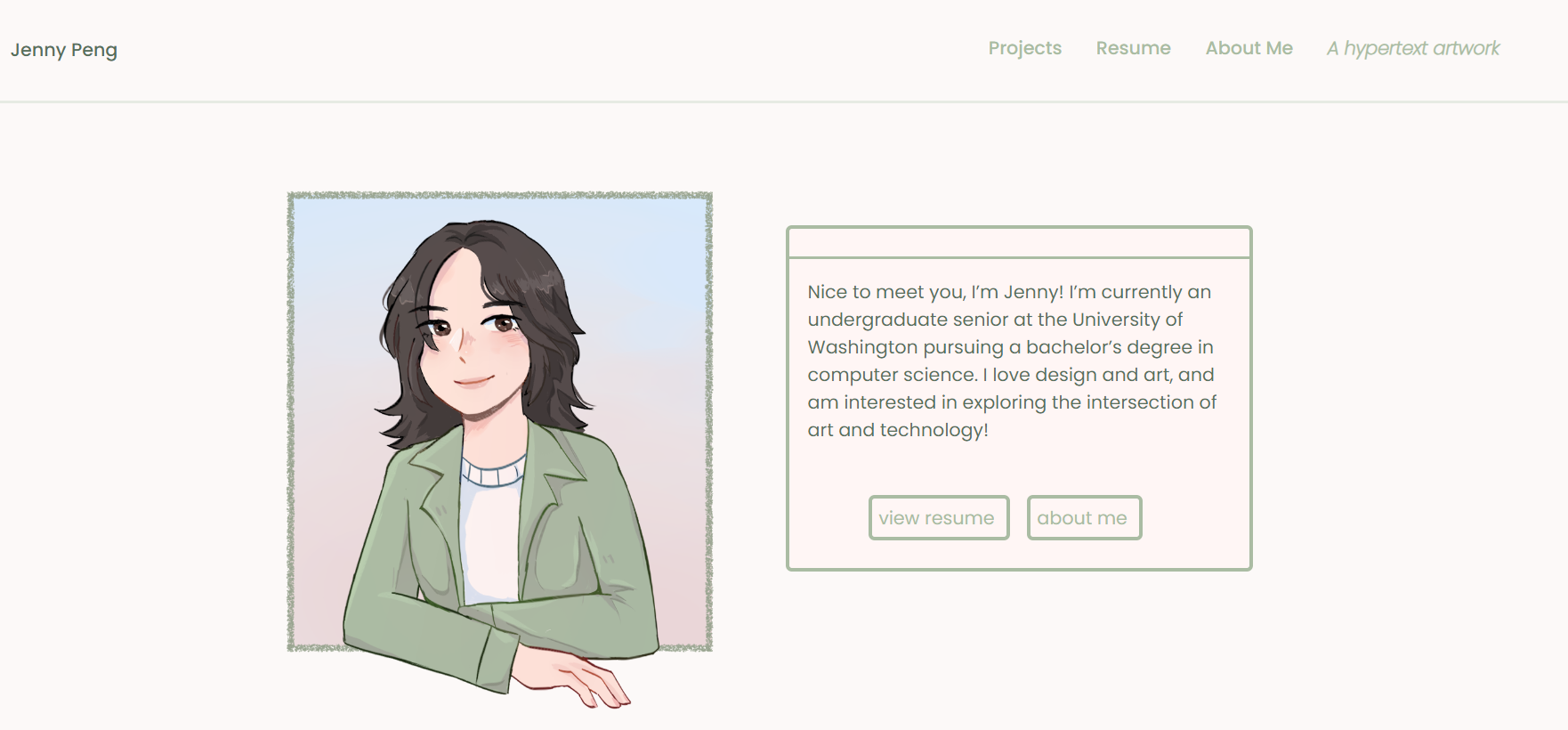
I love polaroids! I just think it's such a fun frame for photos, and again brings in some of the physical world to the digital space.
My previous website also had a polaroid of myself on the 'about me' page, but it had no interactivity. I think subtle interactivity is fun.
How I created the polaroid component, which accepts an image source, alt text, and caption as props:
- White frame is created by wrapping the image with a div with a white bg, padding + extra bottom padding, and hardcoded pixel width and height, and a min width
- I always felt like using pixel units was bad for responsiveness, but in this case, the polaroid doesn't really need to change width and height.
- In
globals.css, I define@keyframes jigglewhich defines the transform's rotation and scale of the polaroid at different keyframes - animation is applied via tailwind as
-rotate-1 transition-transform duration-300 hover:rotate-0 hover:scale-105 hover:animate-[jiggle_0.6s_ease-in-out_forwards]-rotate-1sets default slight counterclockwise rotation- transition styling states that any transform animation will have the specified duration
- the hover:animate runs the jiggle animation for 0.6s -
forwardsmakes it stay at its end state
polaroid scrolling animation
On the 'about me' page, I have an assortment of polaroids stacked at the bottom that spread out on scroll. I like taking photos and I wanted to include some fun ones (inspo1, inspo2).
I also think scrolling animations are fun and not super distracting, because the user is in control over the progression of it.
I created a scatter-polaroids component:
- Defines a ScatterPolaroid interface, which has the same fields as a normal polaroid, as well as initial/final xy offsets for both desktop and mobile
- Defines the actual polaroid data - manually hardcoded in the offsets
Scroll animation w motion js:
- Defines
containerRefwith useRef, which "lets you reference a value that’s not needed for rendering."- Changing a ref does not trigger a re-render, making then good for storing information that doesn’t affect the visual output of a component.
- Gets
scrollYProgressfrom useScroll - tracks scroll progress relative to the target container, which we set ascontainerRef- the ref of the div containing all the polaroids is set to
containerRef - default offset is
["start end", "end end], but here I use["start end", "end start]- the offset describes points where target and container meet - for ex. "start end" could be where the top of the target meets the bottom of the window viewport
- the ref of the div containing all the polaroids is set to
- also uses useEffect to check if we're on mobile based on current window width
- useEffect is for synchronizing with some external system
- adds window event listener on 'resize' for a
checkMobilefunction that updates isMobile and screen dimensions based on window width - so whenever the window is resized, this function runs - Creates useTransform hooks for each polaroid based on their initial and final XY pixels, which are computed by multiplying each polaroid's defined offset (a percentage) with the screen dimension
- maps input to output range based on the scrollYProgress
blob animation
TODO
paper texture on blog pages
I wanted some whimsy/quirkiness to my design. I love texture - I saw one portfolio website that had a continuous grain effect in the background and I thought that was a really interesting way to add visual interest.
TODO
nav bar hover animation
I love incorporating hand-drawn/analog into digital experiences. It's just so fun lol. So I wanted an animated scribble to appear on hover, which I've seen in a few different portfolios.
TODO
general
- anything with repeated styling should have data stored in some structure and map to a generic component (i did this for projects and blog posts, but didn't think initially to do it for nav bar links too - needed to refactor this to apply a fancier svg animation to all nav links)
project gallery
- tailwind breakpoints make it very easy to change sizing of components based on media width
- image sizing and setting appropriate yet responsive max/min width/heights was tricky... I still have a lot to learn about flex and grid properties
TODO
challenges
- Project gallery:
- I struggled a little with how to layout the project cards. I discovered that what I needed was a masonry layout. I attempted to use CSS grid, as I read this was good for 2D layouts over flex, but it was a bit rigid - cards in the same row were forced to be the same height or there was blank space between rows if some cards were shorted in height than others within the same row.
- I found a work-around by changing grid to a column layout, but this meant the project content order was in the column direction rather than row (i.e. most recent projects are in the first column and not the first row). Settled with this for now, will probably look into external libraries later.
- Animations: I really wanted to add some fun, animated visual elements.
- I knew of anime js, motion js, and gsap - I chose to try motion js because it seemed very commonly used and most approachable
- v0 and cursor were useful for starting out, to see how the specific things i need can be done.
- I tried to consider how to make certain animations mobile friendly, specifically the polaroid scroll spread on the about-me page.
- Playful design: while I wanted this to be a somewhat formal showcase of my work, I also wanted it to be playful, artistic, and true to my personality. The design and process involved a lot of exploring what visually feels like me